Hudson Pacific
Category
Brand IdentityAbout This Project
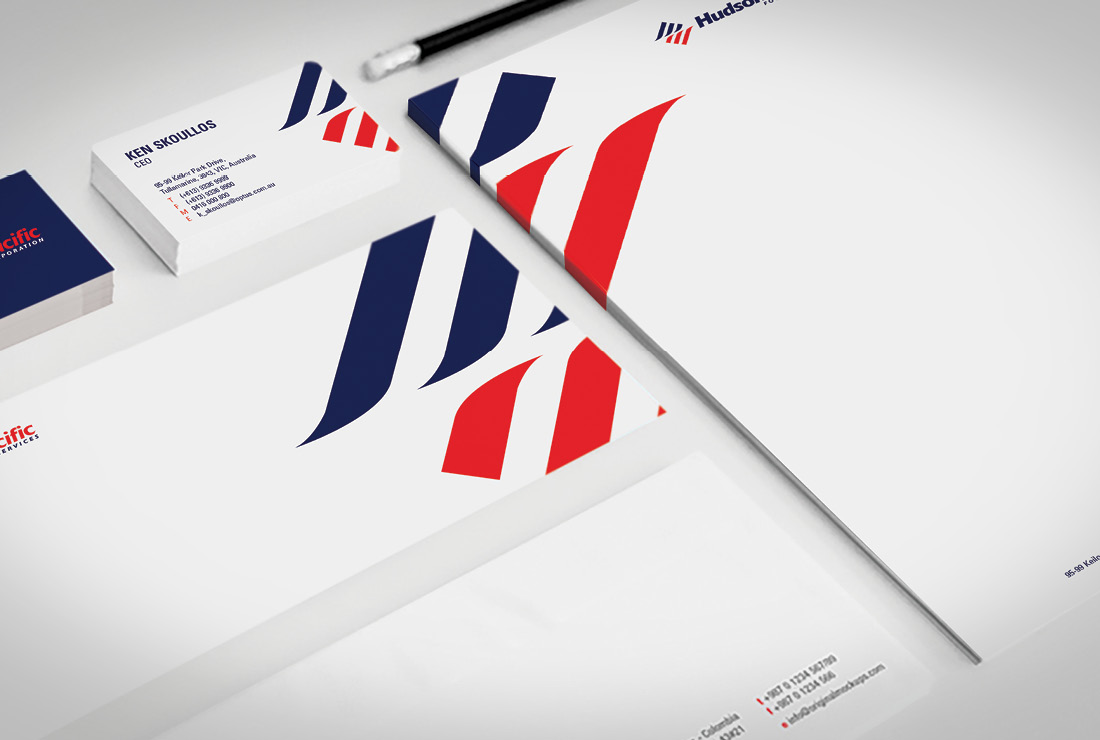
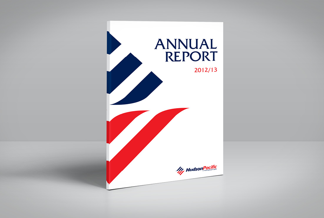
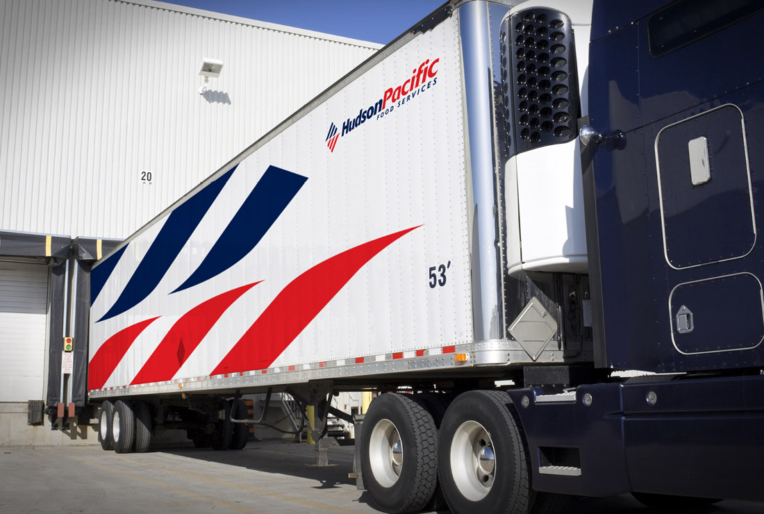
As a nationally recognised food service provider Hudson Pacific needed a brand that was strong and flexible. The branding was designed to be clear-cut and dynamic with graphic shapes used in an identifiable red and navy colour scheme with complimenting typography.


